


Words: Chris Rodermond
Photos: James Haefner, Kevin Marshall
In 2015 the University of Michigan broke ground on a 28.5M USD renovation and updated the Taubman building, the home of the University’s Architecture and Urban Design department. In 2017 the 37,000 gross sq. ft. addition and 11,000 gross sq. ft. renovation project was completed by Integrated Design Solutions and Preston Scott Cohen Inc. with construction services provided by Christman Company. MASONRY Magazine got to sit down with Kevin Marshall, AIA, LEED AP BD+C, and Senior Associate at Integrated Design Solutions, who explained the process for completing this striking and high stakes project.
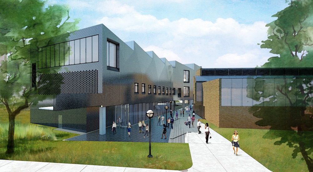
Marshall told us that before the fall semester of 2017, the A. Alfred Taubman College of Architecture and Urban Planning at the University of Michigan shared a facility with the Penny W. Stamps School of Art and Design. Because Stamps occupied the portion of the building that fronted Bonisteel Boulevard, Taubman was concealed behind a courtyard. At the same time, the two academic institutions would still share a facility, the new A. Alfred Taubman Wing would be positioned to link the college to a major campus artery physically. Designed to increase visibility, this new appendage now functions as a new front door for the College of Architecture and Urban Planning.
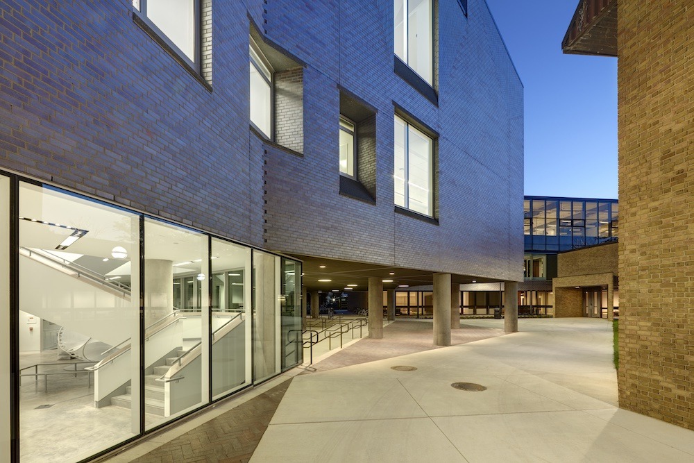
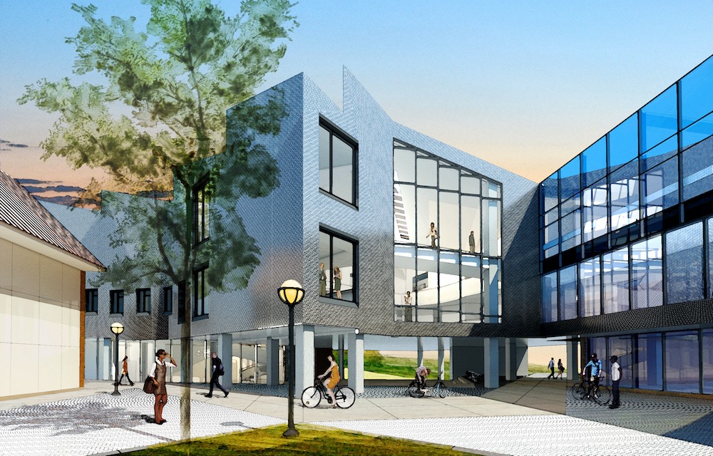
Connecting to the existing facility via a glass-enclosed bridge, the new wing extends at an angle to the northeast toward Bonisteel. The interior of this new wing functions as the nexus for the college with an art gallery, large two-story student commons, and a much-needed expansion of faculty offices and studio space. The modern design of the building’s interior is painstakingly restrained, with simple finishes mostly painted white allowing light and shadow to dance throughout the unique volumes. This interior aesthetic stands in stark contrast to the dark monolithic exterior clad in a purplish-gray semi-gloss iron spot brick.
Regarding safety, Mr. Marshall noted that this was an active college building. We had to do very careful grass separations and scaffold in tunneling and other things to allow the students to get in and out of the adjacent building. That was an important thing, and then the green space to the southeast of the building visible to the undercroft is a large stormwater detention facility. So they had to be careful with any snow runoff or soil erosion or that kind of stuff from getting in and clogging that system up.
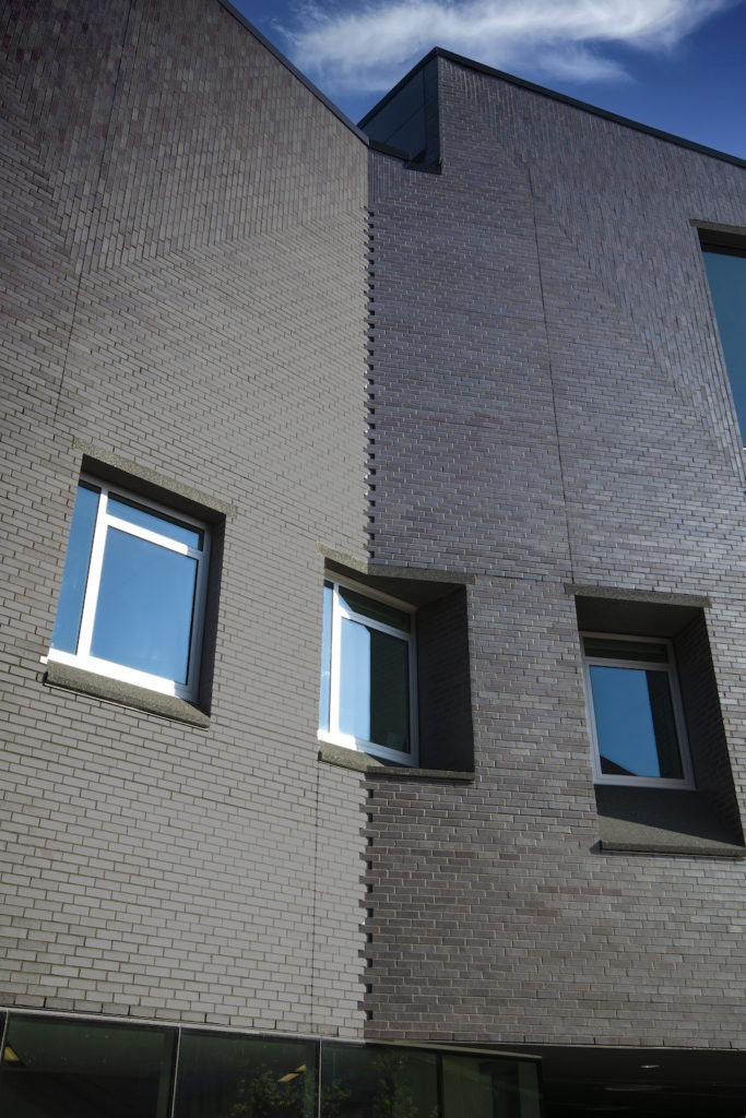
From a distance, the building’s exterior expression appears to be a straightforward utilitarian use of brick. However, as one moves closer to the building, the subtle masonry detailing is a master class of craftsmanship executed by the masons. The masonry starts with a unique angled herringbone pattern on the north façade that is punctuated with air intake openings integrated within the brick. As one moves east and west elevations, the third bond coursing bends into obtuse corners that appear stitched together with overlapping gaps. With the transition into the sawtooth roof monitors, the brick shifts from third bond coursing to a unique vertical running bond that creates a subtle repetitive V-shaped pattern across each façade. All the building faces are then punctured with a series of windows whose random placement and sizes reflect the scale of each space beyond.
To design a school of architecture addition is a daunting thought given the nature and training of the building occupants. The overarching goal for the project was to create an identity and soul for the College of Architecture and Design. At the time, the dean of the College, Monica Ponce de Leon, was a strong guide for the team and shepherded the vision for the addition with design partner Preston Scott Cohen. The building’s form, reaching out from the College’s portion of the existing building, expands vertically to allow for a more spacious floor-to-floor height than the existing building while maintaining the maximum height allowances of the International Fire Code. To preserve views from the School of Art & Design courtyard to the green space to the southeast, the project took advantage of the desire to have the primary program elevated on the second and third floors by creating an undercroft that can also serve as an outdoor critique and gathering space for the program. From a distance, the building maintains a monolithic form with the sawtooth form of the roof, adding visual interest and allowing reflected sunlight to flood the interior of the third-floor studio space.
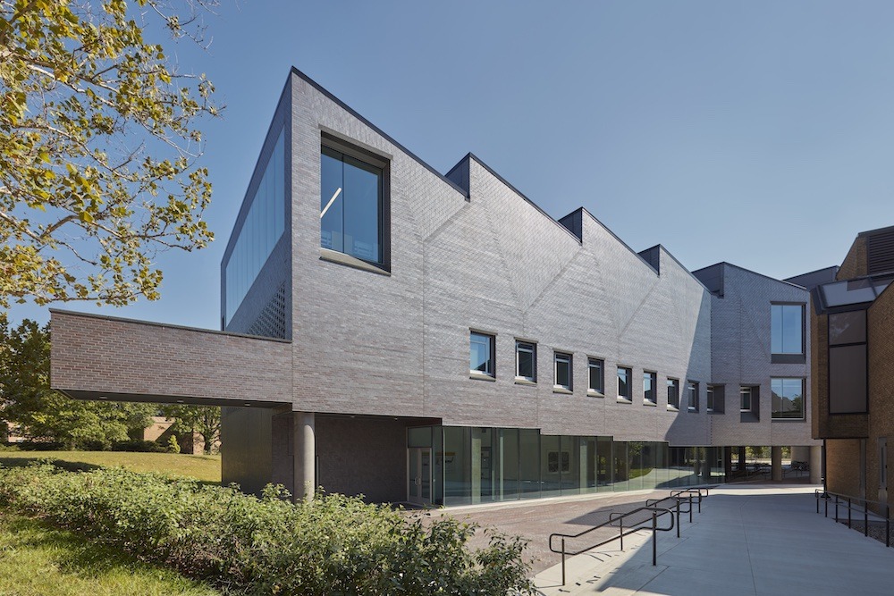
Brick patterning breaks up the façade when close to the building adding to its dynamic form with the north façade set in a herringbone pattern with a Flemish bond brick louver providing air intake and exhaust for the building. On the east and west facades, the brick patterning comprises both horizontal and vertical 1/3 running bonds. Since the building is reaching out from the College’s primary classroom space to the south, the plan bends, creating an inviting opening between the new wing and the existing building. These “bends” are articulated with woven brick creating small voids in the elevation as the brick turns the corner rather than introducing custom brick shapes.
Integrated Design Solutions was partnered with Preston Scott Cohen, Inc and acted as Architect of Record for the project. Additional consultants on the project were Structural Design Incorporated (Structural Engineer) and Beckett & Raeder, Inc (Civil Engineer/Landscape Architect)
The materials used for the project were Brazen and Greer Masonry, and the brick used on the project was Endicott Clay Products Dark Ironspot Smooth Modular. That brick was done on a formed metal stud framing system with no cavity wall insulation. He added that they used the window sills for the punched openings of our custom precast concrete mix. That also carried into some of the materials at the undercroft area at the south building’s southeast corner roof is just a typical black single-ply EPDM Roof. They had so few specialty bricks that they had to do; some were at the front louver that was partially stained black to help them disappear to look like a louver in the areas that were not active vents.
Marshall told us about the construction process from a design perspective. They normally design to overall masonry dimensions and coursing and do not get that particular with the brick layout. However, for this project and the intricate patterning, they went several steps further by creating brick setout elevations for the mason contractor to hit and set up wrapping/corner brick details to show intent.
The only real challenges for the masonry portion of the project revolved around getting the precast concrete sills and wall panels to be as dark as the brick. Thanks to our careful study of the brick pattern and setout, the laying of the brick was smooth. This, of course, wouldn’t have been possible without careful attention to detail on the part of the mason contractor, who did an outstanding job in realizing the vision. They addressed this with rounds of color matching to overcome the issues with the precast elements as several samples and iterations had to be made to get the near-black color to the pieces.
The project was developed by the design partner in Rhinoceros 3D and by IDS in Autodesk Revit. Rhinoceros 3D was used to develop the intricate layering of spaces and the overall massing. The Rhino models were brought into Revit to match design intent, and construction documents were developed on that platform. Ultimately a 3D model was turned over to the contractor to aid in above-ceiling coordination and building layout.
Mr. Marshall finished by telling us that the building is kind of a minimalistic building overall in its form, and while it’s detailed, there’s not a lot of ornament to the building — and that’s by design. The interior is even more [minimalistic]. He did not want to say it’s stark but noted it is all white. It’s all about the play of light and shadow on the elements; that’s a big part of this project. So it’s interesting when they added the brick detail with the vertical running bond and the herringbone and those things to add some visual interest up close to the building. One finds out how challenging it is to do a simple building. It sounds kind of counterintuitive, but many times, without ornamentation, more thought and care must be found in details so that the clean aesthetic carries through.