A Look At Detroit Medical Center's Sinai-Grace Hospital
Words: Vanessa Salvia
Words: Vanessa Salvia
Photos Courtesy of SmithGroup, James Haefner
A multi-year renovation of Detroit Medical Center's Sinai-Grace Hospital has finally wrapped up. The results significantly remodel and expand the hospital, which was originally built in the 1930s. Design planning to remodel and expand the outdated but very busy hospital first began in 2011, under the guidance of Luigi Coletta, principal architect of SmithGroup, an architectural firm in downtown Detroit.
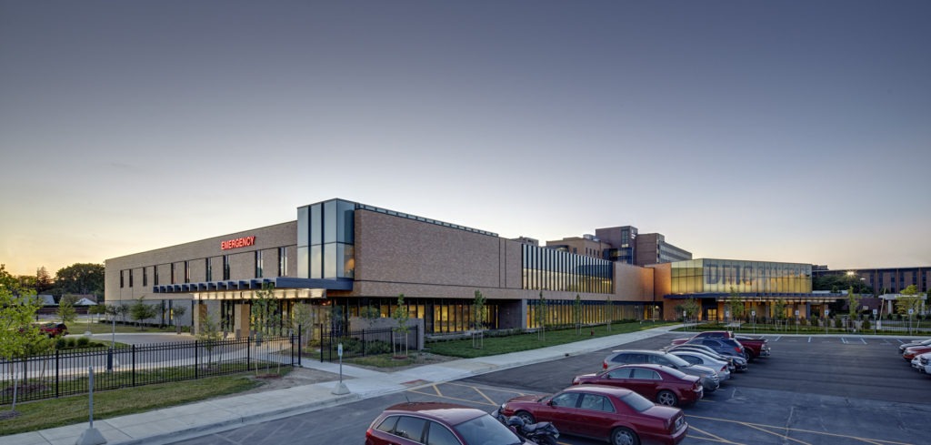
The $77-million, multi-year renovation project first took on a new emergency department in phase 1, completed in February 2014, then a new intensive care unit in phase 2, completed in February 2015. The final phase created a new main entrance, lobby, admitting, and radiology areas. A burnished, orange brick that closely matches that of the original Grace Hospital Building was a key material used in the renovation.
"Detroit Medical Center has a long history of growth with many different additions and renovations that have happened over the years," Coletta says. "But the hospital was not large enough for the volume of patients and staff they had."
Coletta says the level of service the hospital provided remained great because the staff made the most of the facilities they had to work with. But some areas of the hospital were cramped and overcrowded, in particular the emergency medicine area. Also, the emergency department and the main entry to the hospital were adjacent to each other, which caused some confusion to people, because people needing to go to the emergency room would enter from the main lobby or vice versa.
"It's good hospital design to separate them, just because there's a different flow of people into each department," says Coletta. "Our main goal was to separate and decentralize the emergency department from the main entry."
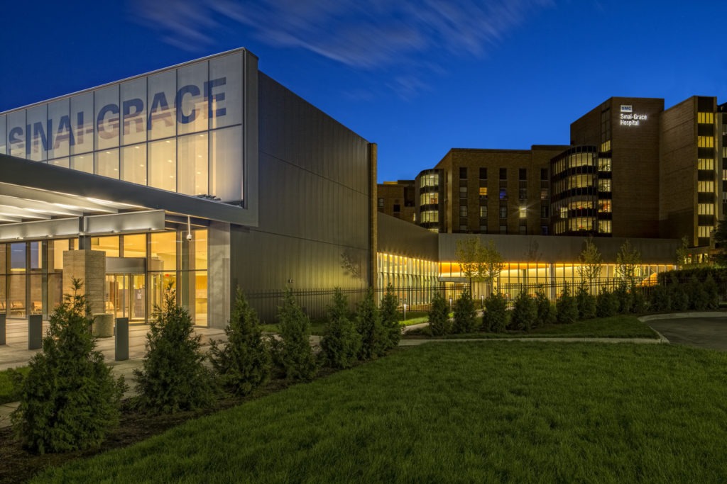
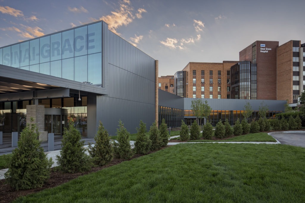
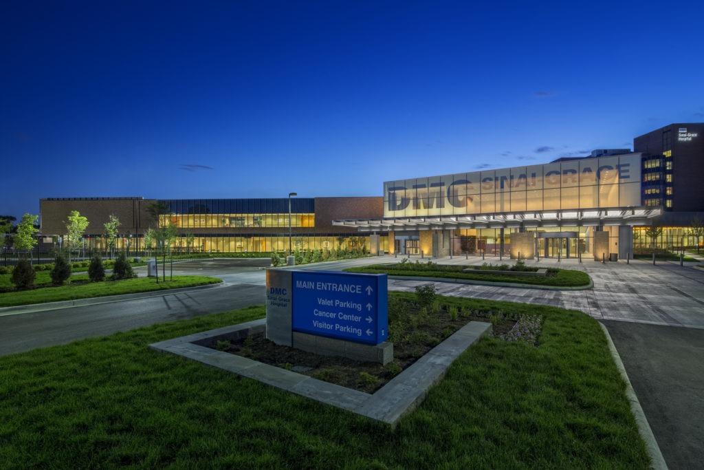
The design group recognized a "very strong language" in the exterior architecture, which tied into the history of DMC Sinai Grace and was something worth preserving. Of three schematic designs created by SmithGroup in April 2011, then-DMC CEO Mike Duggan selected a concept called "The Beacon." Symbolically, the hospital is a beacon to the neighborhood. During the day, the burnished block, brick, and glass exterior of the large, two-story main entry reflect light. At night, it glows like a lantern. Large letters spelling DMC and Sinai-Grace on the second story of the exterior are legible both during the day and at night but in different expressions.
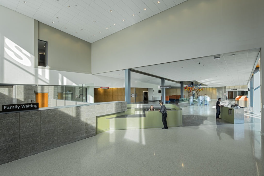
The project entailed a new 18,000-square-foot lobby that triples its previous size, with a dedicated admitting area. The Radiology Department which is adjacent to the main lobby is now 24,000 square feet, nearly four times larger than its prior size. The new emergency department is the busiest in all of Detroit and now has space it deserves at 59,000 square feet, more than double its previous size. Designers provided separate entrances for walk-ins and ambulance arrival and 94 new patient treatment areas (including 42 hard-walled exam rooms). Expansions to nursing stations allow hospital staff to efficiently manage up to 125,000 patients each year.
Coletta says the team had to ensure that the existing patient portion of the existing lobby remained open during construction. To ensure that, they worked with teams from Turner Construction and White Construction to manage phasing, logistics, budgeting and to ensure everyone was on the same page for the project.
"We knew early on that we wanted the new exterior materials of the new areas to relate to the existing hospital, and the existing hospital was essentially a brick building," Coletta explains. "They had accents here and there, but the orange brick was very natural to the project."
The only problem was, this orange brick had been discontinued. The team had to turn to different manufacturers to find a material that came close to the existing brick.
"Luckily for us, the new brick never touched the existing brick, it was separated a little bit," Coletta says. "So even though we weren't able to match it exactly, we were able to get a very good blend of bricks, and because it was separate from the hospital a little bit, it actually looks almost perfect. From a distance, you can't really tell that it's a different brick."
Experts from both Brick Tec in Milford, Ohio, and Belden Brick in Canton, Ohio, worked tirelessly, and ultimately Brick Tec had the closest brick to the existing. Adding a burnished block in a darker color than the orange brick gave the building a fresh look. Coletta notes that one strong design language of the existing hospital was that the window treatments created an appearance of tall ribbons.
"We didn't literally reproduce that on the new exterior, but we created the same pattern within the expanses of glass," he says.
They used a two-sided Structural Silicone Glazed with an extruded mullion extension to accentuate the verticality. A mullion can be a decorative or supportive element in between units of a window or screen. The new exterior, Coletta says, reflects that vertical element of the existing building without directly referencing it.
In addition to the "beacon" theme, another guiding element was the concept of clarity in the sense of the simplicity of the language of the building.
"We have moments of something grand but because people are actually walking in and experiencing this building, you must have some sense of clarity to be able to understand that one entry is the main entry and another is the secondary entry," he says. "There must be some clarity and simplicity in order for the person walking through to know how to go from point A to point B and what the connection is."
The other guiding element was efficiency, both in space and in materials. The DMC staff had long shown efficiency due to embracing the limitations of the previous building. The SmithGroup team didn't want them to lose their ability to work efficiently despite the sometimes drastically increased size of the new areas.
"We tried to be as efficient as possible with materials," Coletta says. "We didn't try to force certain aesthetic ideas onto the client in any way. We did the best that we could with the budget that we had, knowing the most important part of the project was providing the spaces that the staff and the patients needed to be respected and properly taken care of."
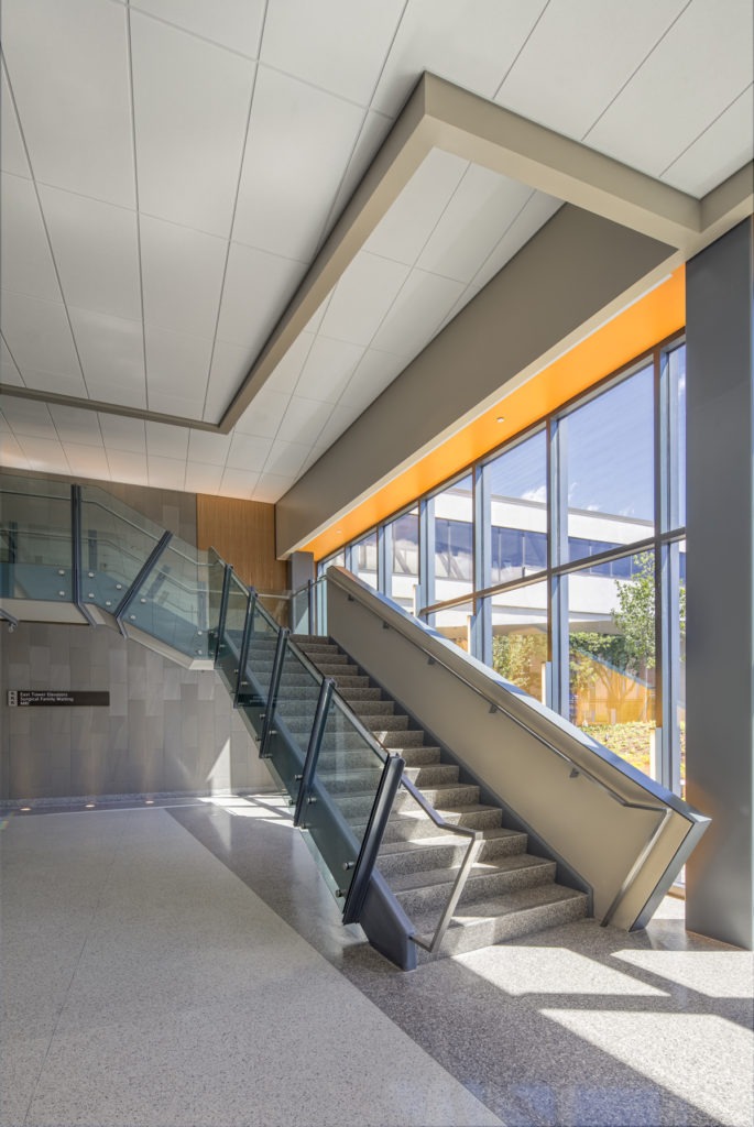
As visitors enter from either entrance, the masonry elements continue into the building to create a connection. Flooring in all the public spaces is durable and strong terrazzo used in a couple of different colors. Simple paint color changes differentiate different zones for wayfinding. A stair flows people up into the main elevator, although there is also access to the elevator on the first floor. Coletta notes that the stair turned into an important focal point of the project because of its importance in visually and physically connecting the 2 floors.
"And there are no columns supporting the stair between where it starts on the ground to where it lands on the second floor," he says. "To reduce the structural load, the structural engineer wanted to add columns at the intermediate landing where it turns the corner, but we asked them to make the stair's stringer strong enough to hold itself up from a single span. At first, there was some resistance because it's not as conventional, but it was definitely achievable."
Although brick and block was the primary material, metal was also important. When metal was used, it was kept within a minimal palette for a sense of continuity.
"We did use various different types of metal so that was a big design language there," Coletta says. "There's metal in the mullion, there's metal in the exterior steel, the canopy at the main entry and the ambulance entry was all exposed steel. And in between the steel we had a metal panel with metal to separate the block with the brick. It all stayed within the same look although they were different metals with different functions."
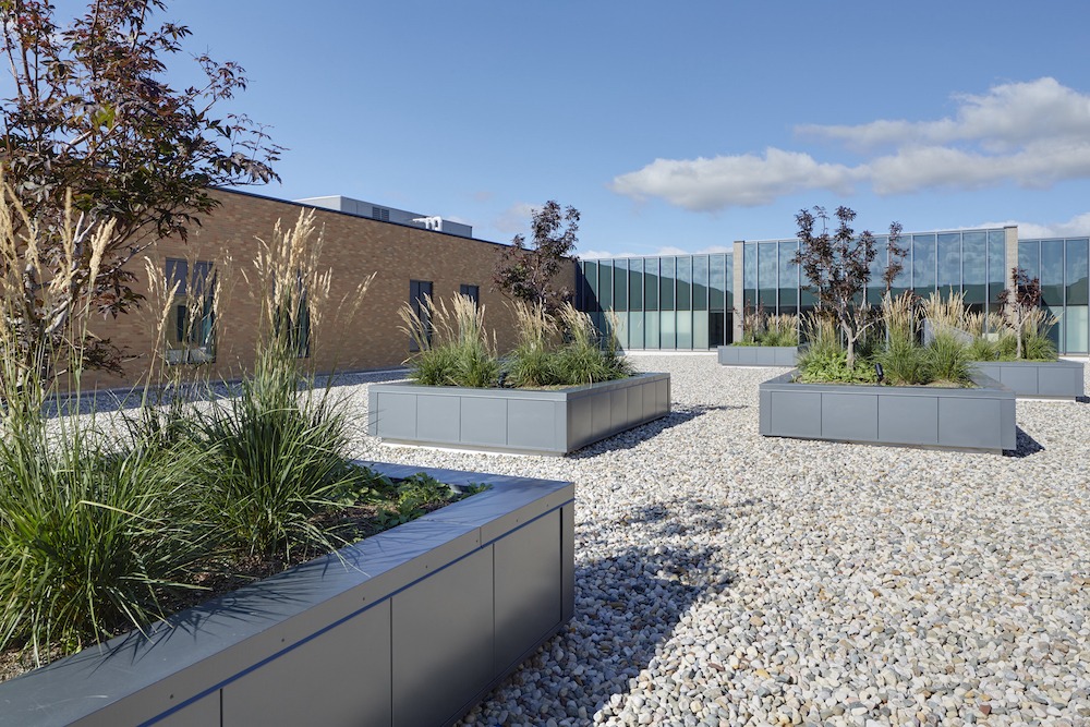
A second-floor river rock courtyard provides views of nature from the ICU beds, and provided for some daylight to filter from outside down into the first-floor corridor and the emergency department corridor.
"The lack of daylight makes most hospitals feel the same," Coletta says. "So we're lucky enough to be able to bring some daylight to the corridors and interior."
One challenge Coletta encountered was locating a leak between the main entry and the courtyard that was already present but its source was hidden. The construction team had to somewhat expose certain interior areas to be able to find the leak, which was caused by flashing that needed to be redone.
SmithGroup uses a lot of different tools in its design work, including Revit, a powerful building modeling software. For a complicated project like this, Revit was used extensively. They sent Revit 3D models to the contractor, who was able to convert them into Navisworks files. Since SmithGroup's architectural, mechanical, electrical, plumbing, lighting, and structural teams were all in-house, they all utilized the same software and design tools, which allowed them to see any possible issues or concerns early in the process.
 DMCSinaiGrace Ext03.jpg
SmithGroup's lighting designers had to work extensively to test the lighting options for the main entryway, which ended up winning several lighting design awards. The lighting team provided two different films that go on the inside of the glazing. One layer controls the amount of daylight coming into space and a second one makes it more reflective. Using software like Autodesk 3ds Max (formerly 3D Studio and 3D Studio Max) to visualize both in aesthetics and also in actual lumens, the lighting team determined that during the night viewing of the beacon, the letters needed additional lights to increase the brightness of the interior surfaces, and also light on the exterior pointing to the glass, with the outside lighting source hidden.
While most people will probably hope that they never have to see the inside of a hospital, if they do, such attention to detail makes it no surprise that Detroit Medical Center's Sinai-Grace Hospital is now even more of a beacon to the neighborhood and city than it was before.